Google AMP - 动画
Amp-animation 是一个 amp 组件,它定义了要在其他 amp 组件上使用的动画。本章将详细讨论它们。
要使用 amp-animation,我们需要添加以下脚本 −
<script async custom-element = "amp-animation"
    src = "https://cdn.ampproject.org/v0/amp-animation-0.1.js">
</script>
动画的细节在 json 结构中定义。
amp-animation 的基本结构如下所示 −
<amp-animation layout = "nodisplay">
   <script type = "application/json">
      {
         // Timing properties
         ...
         "animations": [
            {
               // animation 1
            },
            ...
            {
               // animation n
            }
         ]
      }
   </script>
</amp-animation>
animation 动画组件由以下 − 选择器、变量、时间属性、关键帧等组成。
{
   "selector": "#target-id",
   // Variables
   // Timing properties
   // Subtargets
   ...
   "keyframes": []
}
selector 选择器
在这里我们需要给出将使用动画的元素的类或 ID。
变量
它们是定义为在关键帧内使用的值。变量使用 var() 定义。
示例
{
   "--delay": "0.5s",
   "animations": [
      {
         "selector": "#target1",
         "delay": "var(--delay)",
         "--x": "150px",
         "--y" : "200px",
         "keyframes": {
            "transform": "translate(var(--x), var(--y, 0px)"
         }
      }
   ]
}
此处 delay、x 和 y 是变量,变量的值在所示示例中定义。
时间属性
您可以在此处定义动画的持续时间和延迟。以下是支持的计时属性 −
| 属性 | 值 | 说明 |
|---|---|---|
| duration | 时间属性。值必须以毫秒为单位。 | 动画使用的持续时间。 |
| delay | 时间属性。值必须以毫秒为单位。 | 动画开始执行前的延迟 |
| endDelay | 时间属性。值必须以毫秒或秒为单位。 | 动画完成时应用的给定延迟。 |
| iterations | 值必须为数字。 | 动画必须重复的次数。 |
| iterationStart | 值必须为数字。 | 效果开始动画的时间偏移量。 |
| easing | 值为字符串 | 用于获取动画的缓动效果。一些缓动的示例有 linear 、ease、ease-in、ease-out 、ease-in-out 等 |
| direction | 值是一个字符串 | "normal"、"reverse"、"alternate"或"alternate-reverse"之一。 |
| fill | 值是一个字符串 | 值可以是"none"、"forwards"、"backwards"、"both"、"auto"。 |
Keyframes
Keyframes 关键帧可以通过多种方式定义,例如对象形式或数组形式。请考虑以下示例。
示例
"keyframes": {"transform": "translate(100px,200px)"}
示例
{
   "keyframes": {

      "opacity": [1, 0],
      "transform": ["scale(1)", "scale(2)"]
   }
}
示例
{
   "keyframes": [
      {"opacity": 1, "transform": "scale(1)"},
      {"opacity": 0, "transform": "scale(2)"}
   ]
}
示例
{
   "keyframes": [
      {"easing": "ease-out", "opacity": 1, "transform": "scale(1)"},
      {"opacity": 0, "transform": "scale(2)"}
   ]
}
使用 CSS 的关键帧
<style amp-custom>
   div {
      width: 100px;
      height: 100px;
      background-color: red;
      position: relative;
      margin: 0 auto;
      transform:scale(3);
   }
   @keyframes example { 0% {transform:scale(3)}
      75% {transform:scale(2)}
      100% {transform:scale(1)}
   }

</style>

<amp-animation layout = "nodisplay">
   <script type = "application/json">
      {
         "duration": "4s",
         "keyframes": "example"
      }
   </script>
</amp-animation>
有一些 CSS 属性可以在关键帧内使用。受支持的属性称为白名单属性。以下是可以在关键帧内使用的白名单属性 −
- opacity
- transform
- visibility
- 'offsetDistance'
注意 − 使用白名单属性以外的任何其他属性都会在控制台中抛出错误。
现在让我们通过一个简单的示例来了解,当在图像上应用动画时,该示例将旋转图像。在此示例中,我们使用 amp-animation 旋转图像。
示例
<!doctype html>
<html amp lang = "en">
   <head>
      <meta charset = "utf-8">
      <script async src = "https://cdn.ampproject.org/v0.js"></script>
      <title>Google AMP - Amp Video</title>
      <link rel = "canonical" href = "http://example.ampproject.org/article-metadata.html">
      <meta name = "viewport" content = "width = device-width, minimum-scale = 1,initial-scale = 1">

      <style amp-boilerplate>
         body{
            -webkit-animation:
            -amp-start 8s steps(1,end) 0s 1 normal both;-moz-animation:
            -amp-start 8s steps(1,end) 0s 1 normal both;-ms
            -amp-start 8s steps(1,end) 0s 1 normal both;animation:
            -amp-start 8s steps(1,end) 0s 1 normal both
         }
         @-webkit-keyframes
         -amp-start{from{visibility:hidden}to{visibility:visible}}@-moz-keyframes
         -amp-start{from{visibility:hidden}to{visibility:visible}}@-ms-keyframes
         -amp-start{from{visibility:hidden}to{visibility:visible}}@-o-keyframes
         -amp-start{from{visibility:hidden}to{visibility:visible}}@keyframes
         -amp-start{from{visibility:hidden}to{visibility:visible}}
      </style>

      <noscript>
         <style amp-boilerplate>
            body{
               -webkit-animation:none;
               -moz-animation:none;
               -ms-animation:none;
               animation:none
            }
         </style>
      </noscript>

      <script async custom-element = "amp-animation"
         src =" https://cdn.ampproject.org/v0/amp-animation-0.1.js">
      </script>
      <style amp-custom>
         amp-img {
            border: 1px solid black;
            border-radius: 4px;
            padding: 5px;
         }
      </style>
   </head>
   <body>
      <h3>Google AMP - Amp Animation Example</h3>
      <amp-animation id = "anim1" layout = "nodisplay" trigger = "visibility">
         <script type = "application/json">
            {
               "duration": "1s",
               "fill": "both",
               "direction": "alternate",
               "animations": [
                  {
                     "selector": "#image1",
                     "easing": "cubic-bezier(0,0,.21,1)",
                     "keyframes": {
                        "transform": "rotate(20deg)"
                     }
                  }
               ]
            }
         </script>
      </amp-animation>
      <br/>
      <br/>
      <amp-img
         id = "image1"
         src = "images/christmas1.jpg"
         width = 300
         height = 250
         layout = "responsive">
      </amp-img>
      <br/>
   </body>
</html>
输出

上面使用的 amp-animation 细节在下面显示的代码中给出 −
<amp-animation id = "anim1" layout = "nodisplay" trigger = "visibility">
   <script type = "application/json">
   {
      "duration": "1s",
      "fill": "both",
      "direction": "alternate",
      "animations": [
         {
            "selector": "#image1",
            "easing": "cubic-bezier(0,0,.21,1)",
            "keyframes": {
               "transform": "rotate(20deg)"
            }
         }
      ]
   }
   </script>
</amp-animation>
此处的选择器是应用旋转动画的图像的 id −
<amp-img
   id = "image1"
   src = "images/christmas1.jpg"
   width = 300
   height = 250
   layout = "responsive">
</amp-img>
使用 CSS 中的关键帧的示例
示例
<!doctype html>
<html amp lang = "en">
   <head>
      <meta charset = "utf-8">
      <script async src = "https://cdn.ampproject.org/v0.js"></script>
      <title>Google AMP - Amp Video</title>
      <link rel = "canonical" href = "http://example.ampproject.org/article-metadata.html">
      <meta name = "viewport" content = "width = device-width,minimum-scale = 1,initial-scale = 1">
      <style amp-boilerplate>
         body{
            -webkit-animation:
            -amp-start 8s steps(1,end) 0s 1 normal both;-moz-animation:
            -amp-start 8s steps(1,end) 0s 1 normal both;-ms-animation:
            -amp-start 8s steps(1,end) 0s 1 normal both;animation:
            -amp-start 8s steps(1,end) 0s 1 normal both
         }
         @-webkit-keyframes
         -amp-start{from{visibility:hidden}to{visibility:visible}}@-moz-keyframes
         -amp-start{from{visibility:hidden}to{visibility:visible}}@-ms-keyframes
         -amp-start{from{visibility:hidden}to{visibility:visible}}@-o-keyframes
         -amp-start{from{visibility:hidden}to{visibility:visible}}@keyframes
         -amp-start{from{visibility:hidden}to{visibility:visible}}
      </style>
      <noscript>
         <style amp-boilerplate>
            body{
               -webkit-animation:none;
               -moz-animation:none;
               -ms-animation:none;
               animation:none
            }
         </style>
      </noscript>
      <script async custom-element = "amp-animation"
         src = "https://cdn.ampproject.org/v0/amp-animation-0.1.js">
      </script>
      <style amp-custom>
         div {
            width: 100px;
            height: 100px;
            background-color: red;
            position: relative;
            margin: 0 auto;
            transform:scale(3);
         }

         @keyframes example {
            0% {transform:scale(3)}
            75% {transform:scale(2)}
            100% {transform:scale(1)}
         }
      </style>
   </head>
   <body>
      <h3>Google AMP - Amp Animation Example</h3>
      <amp-animation id = "anim1" layout = "nodisplay" trigger = "visibility">
         <script type = "application/json">
            {
               "duration": "3s",
               "fill": "both",
               "direction": "alternate",
               "animations": [{
                  "selector": "#image1",
                  "easing": "cubic-bezier(0,0,.21,1)",
                  "keyframes":"example"
               }]
            }
         </script>
      </amp-animation>
      <br/>
      <br/>
      <div id = "image1"></div>
      <br/>
   </body>
</html>
输出
动画触发器
如果触发器 = "visibility",则默认应用动画。为了在事件上启动动画,我们必须删除触发器 = "visibility",并添加事件以启动动画,如下例所示 −
示例
<!doctype html>
<html amp lang = "en">
   <head>
      <meta charset = "utf-8">
      <script async src = "https://cdn.ampproject.org/v0.js"></script>
      <title>Google AMP - Amp Video</title>
      <link rel = "canonical" href = "http://example.ampproject.org/article-metadata.html">
      <meta name = "viewport" content = "width = device-width,
      minimum-scale = 1,initial-scale = 1">
      <style amp-boilerplate>
         body{
            -webkit-animation:
            -amp-start 8s steps(1,end) 0s 1 normal both;-moz-animation:
            -amp-start 8s steps(1,end) 0s 1 normal both;-ms-animation:
            -amp-start 8s steps(1,end) 0s 1 normal both;animation:
            -amp-start 8s steps(1,end) 0s 1 normal both
         }
         @-webkit-keyframes
         -amp-start{from{visibility:hidden}to{visibility:visible}}@-moz-keyframes
         -amp-start{from{visibility:hidden}to{visibility:visible}}@-ms-keyframes
         -amp-start{from{visibility:hidden}to{visibility:visible}}@-o-keyframes
         -amp-start{from{visibility:hidden}to{visibility:visible}}@keyframes
         -amp-start{from{visibility:hidden}to{visibility:visible}}
      </style>
      <noscript>
         <style amp-boilerplate>
            body{
               -webkit-animation:none;
               -moz-animation:none;
               -ms-animation:none;
               animation:none}
         </style>
      </noscript>
      <script async custom-element = "amp-animation"
         src = "https://cdn.ampproject.org/v0/amp-animation-0.1.js">
      </script>
      <style amp-custom>
         div {
            width: 100px;
            height: 100px;
            background-color: red;
            position: relative;
            margin: 0 auto;
            transform:scale(2);
         }
         @keyframes example {
            0% {transform:scale(2)}
            75% {transform:scale(1)}
            100% {transform:scale(0.5)}
         }
         button{
            background-color: #ACAD5C;
            color: white;
            padding: 12px 20px;
            border: none;
            border-radius: 4px;
            cursor: pointer;
            float: left;
         }
      </style>
   </head>
   <body>
      <h3>Google AMP - Amp Animation Example</h3>
      <amp-animation id = "anim1" layout = "nodisplay">
         <script type = "application/json">
            {
               "duration": "3s",
               "fill": "both",
               "direction": "alternate",
               "animations": [{
                  "selector": "#image1",
                  "easing": "cubic-bezier(0,0,.21,1)",
                  "keyframes":"example"
               }]
            }
         </script>
      </amp-animation>
      <button on = "tap:anim1.start">Start</button>
      <br/>
      <br/>
      <div id = "image1"></div>
   </body>
</html>
请注意,点击开始按钮时动画将开始。
输出
我们在 On 上使用名为 start 的操作来启动动画。同样,还支持其他操作,如下所示 −
- start
- pause
- restart
- resume
- togglePause
- seekTo
- reverse
- finish
- cancel
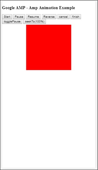
让我们看一个可以使用该操作的工作示例。
示例
<!doctype html>
<html amp lang = "en">
   <head>
      <meta charset = "utf-8">
      <script async src = "https://cdn.ampproject.org/v0.js"></script>
      <title>Google AMP - Amp Video</title>
      <link rel = "canonical" href = "http://example.ampproject.org/article-metadata.html">
      <meta name = "viewport" content = "width=device-width,minimum-scale = 1,initial-scale = 1">

      <style amp-boilerplate>
         body{
            -webkit-animation:
            -amp-start 8s steps(1,end) 0s 1 normal both;-moz-animation:
            -amp-start 8s steps(1,end) 0s 1 normal both;-ms-animation:
            -amp-start 8s steps(1,end) 0s 1 normal both;animation:
            -amp-start 8s steps(1,end) 0s 1 normal both
         }
         @-webkit-keyframes
         -amp-start{from{visibility:hidden}to{visibility:visible}}@-moz-keyframes
         -amp-start{from{visibility:hidden}to{visibility:visible}}@-ms-keyframes
         -amp-start{from{visibility:hidden}to{visibility:visible}}@-o-keyframes
         -amp-start{from{visibility:hidden}to{visibility:visible}}@keyframes
         -amp-start{from{visibility:hidden}to{visibility:visible}}
      </style>

      <noscript>
         <style amp-boilerplate>
            body{
               -webkit-animation:none;
               -moz-animation:none;
               -ms-animation:none;
               animation:none}
         </style>
      </noscript>
      <script async custom-element = "amp-animation"
         src = "https://cdn.ampproject.org/v0/amp-animation-0.1.js">
      </script>
      <style amp-custom>
         #image1 {
            width: 100px;
            height: 100px;
            background-color: red;
            position: relative;
            margin: 0 auto;
            transform:scale(2);
         }
         @keyframes example {
            0% {transform:scale(2)}
            75% {transform:scale(1)}
            100% {transform:scale(0.5)}
         }
         button1{
            background-color: #ACAD5C;
            color: white;
            padding: 12px 20px;
            border: none;
            border-radius: 4px;
            cursor: pointer;
            float: left;
         }
      </style>
   </head>
   <body>
      <h3>Google AMP - Amp Animation Example</h3>
      <amp-animation id = "anim1" layout = "nodisplay">
         <script type = "application/json">
            {
               "duration": "3s",
               "fill": "both",
               "direction": "alternate",
               "animations": [{
                  "selector": "#image1",
                  "easing": "cubic-bezier(0,0,.21,1)",
                  "keyframes":"example"
               }]
            }
         </script>
      </amp-animation>
      <button on = "tap:anim1.start">Start</button>
      <button on = "tap:anim1.pause">Pause</button>
      <button on = "tap:anim1.resume">Resume</button>
      <button on = "tap:anim1.reverse">Reverse</button>
      <button on = "tap:anim1.cancel">cancel</button>
      <button on = "tap:anim1.finish">finish</button>
      <button on = "tap:anim1.togglePause">togglePause</button>
      <button on = "tap:anim1.seekTo(percent = 1.00)">seekTo(100%)</button>
      <br/>
      <br/>
      <br/>
      <br/>
      <div id="image1"></div>
   </body>
</html>
输出