
Google AMP - 属性
本章将讨论 amp-components 使用的所有常见属性。
常见属性列表如下 −
- fallback
- heights
- layout
- media
- noloading
- on
- placeholder
- sizes
- width 和 height
fallback 属性
fallback 属性主要用于浏览器不支持所用元素、文件加载出现问题或所用文件出现错误的情况。
例如,您正在使用 amp-video,而媒体文件在浏览器上出现问题,因此在这种情况下,我们可以指定 fallback 属性并显示无法播放媒体文件的消息或浏览器不支持,而不是在页面上显示错误消息。
amp-video 上使用的后备
<amp-video controls
   width = "640"
   height = "360"
   layout = "responsive"
   poster = "images/videoposter.png">
   <source src = "video/bunny.webm" type = "video/webm" />
   <source src = "video/samplevideo.mp4" type = "video/mp4" />
   <div fallback>
      <p>This browser does not support the video element.</p>
   </div>
</amp-video>
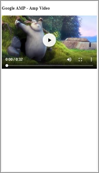
让我们通过一个示例了解操作系统回退的工作原理 −
示例
<!doctype html>
<html amp lang = "en">
   <head>
      <meta charset = "utf-8">
      <script async src = "https://cdn.ampproject.org/v0.js"></script>
      <title>Google AMP - Amp Video</title>
      <link rel = "canonical" href = "      http://example.ampproject.org/article-metadata.html">
      <meta name = "viewport" content = "width = device-width,minimum-scale = 1,initial-scale = 1">

      <style amp-boilerplate>
         body{
            -webkit-animation:
            -amp-start 8s steps(1,end) 0s 1 normal both;-moz-animation:
            -amp-start 8s steps(1,end) 0s 1 normal both;-ms-animation:
            -amp-start 8s steps(1,end) 0s 1 normal both;animation:
            -amp-start 8s steps(1,end) 0s 1 normal both
         }
         @-webkit-keyframes
         -amp-start{from{visibility:hidden}to{visibility:visible}}@-moz-keyframes
         -amp-start{from{visibility:hidden}to{visibility:visible}}@-ms-keyframes
         -amp-start{from{visibility:hidden}to{visibility:visible}}@-o-keyframes
         -amp-start{from{visibility:hidden}to{visibility:visible}}@keyframes
         -amp-start{from{visibility:hidden}to{visibility:visible}}
      </style>

      <noscript>
         <style amp-boilerplate>
            body{
               -webkit-animation:none;-moz-animation:none;
               -ms-animation:none;animation:none
            }
         </style>
      </noscript>

      <script async custom-element = "amp-video"
         src = "https://cdn.ampproject.org/v0/amp-video-0.1.js">
      </script>
   </head>
   <body>
      <h3>Google AMP - Amp Video</h3>
      <amp-video controls
         width = "640"
         height = "360"
         layout = "responsive"
         poster = "images/videoposter.png">
         <source src = "video/bunny.webm"type="video/webm" />
         <source src = "video/samplevideo.mp4"type = "video/mp4" />
         <div fallback>
            <p>This browser does not support the video element.</p>
         </div>
      </amp-video>
   </body>
</html>
输出
高度属性
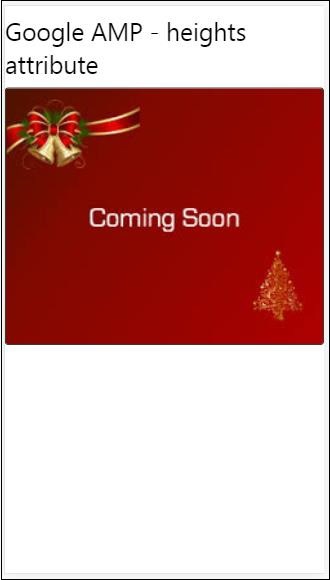
此属性基本支持响应式布局。您可以将媒体表达式用于高度属性,并将其应用于元素的高度。它还采用百分比值,因此高度是根据给定的百分比宽度计算的。
示例
<!doctype html>
<html amp lang = "en">
   <head>
      <meta charset = "utf-8">
      <script async src = "https://cdn.ampproject.org/v0.js"></script>
      <title>Google AMP - heights attribute</title>
      <link rel = "canonical" href = "http://example.ampproject.org/article-metadata.html">
      <meta name = "viewport" content = "width=device-width,minimum-scale = 1,initial-scale = 1">

      <style amp-boilerplate>
         body{
            -webkit-animation:
            -amp-start 8s steps(1,end) 0s 1 normal both;-moz-animation:
            -amp-start 8s steps(1,end) 0s 1 normal both;-ms-animation:
            -amp-start 8s steps(1,end) 0s 1 normal both;animation:
            -amp-start 8s steps(1,end) 0s 1 normal both
         }
         @-webkit-keyframes
         -amp-start{from{visibility:hidden}to{visibility:visible}}@-moz-keyframes
         -amp-start{from{visibility:hidden}to{visibility:visible}}@-ms-keyframes
         -amp-start{from{visibility:hidden}to{visibility:visible}}@-o-keyframes
         -amp-start{from{visibility:hidden}to{visibility:visible}}@keyframes
         -amp-start{from{visibility:hidden}to{visibility:visible}}
      </style>

      <noscript>
         <style amp-boilerplate>
            body{
               -webkit-animation:none;-moz-animation:none;
               -ms-animation:none;animation:none
            }
         </style>
      </noscript>

      <style amp-custom>
         amp-img {
            border: 1px solid black;
            border-radius: 4px;
            padding: 5px;
         }
         h1{font-family: "Segoe UI",Arial,sans-serif;font-weight: 400;margin: 10px 0;}
      </style>
   </head>
   <body>
      <h1>Google AMP - heights attribute</h1>
      <amp-img src = "images/christmas1.jpg"
         width = "320" height = "256"
         heights = "(min-width:500px) 200px, 80%">
      </amp-img>
   </body>
</html>
输出
layout 属性
AMP-Layout 是 google-amp 中的重要功能之一。Amp Layout 确保页面加载时正确呈现 amp 组件,而不会引起任何闪烁或滚动问题。它还会在执行任何其他远程资源(如图像的 http 请求、数据调用)之前检查页面渲染。
amp 支持的布局列表如下 −
- Not Present
- Container
- fill
- fixed
- fixed-height
- flex-item
- intrinsic
- nodisplay
- Responsive
您将在本教程的 Google AMP − 布局 一章中详细了解相关内容。
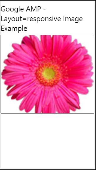
让我们借助如下所示的示例了解 layout="responsive" 的工作原理 −
示例
<!doctype html>
<html amp lang = "en">
   <head>
      <meta charset = "utf-8">
      <script async src = "https://cdn.ampproject.org/v0.js"></script>
      <title>Google AMP - Image>/title>
      <link rel = "canonical" href = "      http://example.ampproject.org/article-metadata.html">
      <meta name = "viewport" content = "width = device-width,minimum-scale = 1,initial-scale = 1">

      <style amp-boilerplate>
         body {
            -webkit-animation:
            -amp-start 8s steps(1,end) 0s 1 normal both;-moz-animation:
            -amp-start 8s steps(1,end) 0s 1 normal both;-ms-animation:
            -amp-start 8s steps(1,end) 0s 1 normal both;animation:
            -amp-start 8s steps(1,end) 0s 1 normal both
         }
         @-webkit-keyframes
         -amp-start{from{visibility:hidden}to{visibility:visible}}@-moz-keyframes
         -amp-start{from{visibility:hidden}to{visibility:visible}}@-ms-keyframes
         -amp-start{from{visibility:hidden}to{visibility:visible}}@-o-keyframes
         -amp-start{from{visibility:hidden}to{visibility:visible}}@keyframes
         -amp-start{from{visibility:hidden}to{visibility:visible}}
      </style>

      <noscript>
         <style amp-boilerplate>
            body {
               -webkit-animation:none;-moz-animation:none;
               -ms-animation:none;animation:none
            }
         </style>
      </noscript>

      <style amp-custom>
         amp-img {
            border: 1px solid black;
            border-radius: 4px;
            padding: 5px;
         }
         displayitem {
            display: inline-block;
            width: 200px;
            height:200px;
            margin: 5px;
         }
         h1{font-family: "Segoe
         UI",Arial,sans-serif;font-weight: 400;margin: 10px 0;}
      </style>
   </head>
   <body>
      <h1>Google AMP - Layout = responsive Image Example>/h1>
      <div class = "displayitem">
         <amp-img alt = "Beautiful Flower"
            src = "images/flower.jpg"
            width = "246"
            height = "205"
            layout = "responsive">
         </amp-img>
      </div>
   </body>
</html>
输出
媒体属性
此属性可用于大多数 amp 组件。它需要媒体查询,如果值不匹配,则不会呈现组件。
让我们借助示例了解媒体属性的工作原理 −
示例
<!doctype html>
<html amp lang = "en">
   <head>
      <meta charset = "utf-8">
      <script async src = "https://cdn.ampproject.org/v0.js"></script>
      <title>Google AMP - Image</title>
      <link rel = "canonical" href = " http://example.ampproject.org/article-metadata.html">
      <meta name = "viewport" content = "width = device-width,minimum-scale = 1,initial-scale = 1">

      <style amp-boilerplate>
         body{
            -webkit-animation:
            -amp-start 8s steps(1,end) 0s 1 normal both;-moz-animation:
            -amp-start 8s steps(1,end) 0s 1 normal both;-ms-animation:
            -amp-start 8s steps(1,end) 0s 1 normal both;animation:
            -amp-start 8s steps(1,end) 0s 1 normal both
         }
         @-webkit-keyframes
         -amp-start{from{visibility:hidden}to{visibility:visible}}@-moz-keyframes
         -amp-start{from{visibility:hidden}to{visibility:visible}}@-ms-keyframes
         -amp-start{from{visibility:hidden}to{visibility:visible}}@-o-keyframes
         -amp-start{from{visibility:hidden}to{visibility:visible}}@keyframes
         -amp-start{from{visibility:hidden}to{visibility:visible}}
      </style>

      <noscript>
         <style amp-boilerplate>
            body {
               -webkit-animation:none;-moz-animation:none;
               -ms-animation:none;animation:none
            }
         </style>
      </noscript>
      <style amp-custom>
         amp-img {
            border: 1px solid black;
            border-radius: 4px;
            padding: 5px;
         }
         h1{font-family: "Segoe
         UI",Arial,sans-serif;font-weight: 400;margin: 10px 0;}
      </style>
   </head>
   <body>
      <h1>Google AMP - Media Attribute</h1>
      <div class = "displayitem">
         <amp-img
            media = "(min-width: 600px)"
            src = "images/christmas1.jpg"
            width = "466"
            height = "355"
            layout = "responsive">
         </amp-img>
      </div>
   </body>
</html>
我们在 <amp-img> 标签上使用了媒体属性,如下所示 −
<amp-img
   media = "(min-width: 600px)"
   src = "images/christmas1.jpg"
   width = "466"
   height = "355"
   layout = "responsive">
</amp-img>
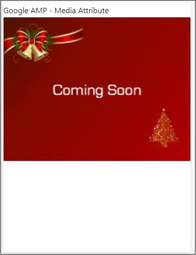
请注意,如果屏幕宽度小于 600px,则不会显示图像。我们将使用 Google 模拟器移动模式来测试示例。
智能手机上的输出
我们在设备上检查了图像不可见,因为设备的宽度小于 600px。如果我们在平板电脑上检查,我们会得到如下所示的输出 −
IPAD 上的输出
Noloading 属性
Amp 组件(如 <amp-img>、<amp-video>、<amp-facebook>)在实际内容加载并显示给用户之前会显示加载指示器。
要停止显示加载指示器,我们可以使用 noloading 属性,如下所示 −
<amp-img src = "images/christmas1.jpg"
   noloading
   height = "300"
   width = "250"
   layout = "responsive">
</amp-img>
On 属性
on 属性用于元素上的事件处理和 amp-components 上的操作。使用 on 属性的语法如下 −
语法 −
on = "eventName:elementId[.methodName[(arg1 = value, arg2 = value)]]"
传递给 on 属性的详细信息如下 −
eventName − 这采用可用于 amp-component 的事件的名称。例如,对于表单,我们可以使用 submit-success、submit-error eventNames。
elementId − 这采用需要调用事件的元素的 id。它可以是我们想要了解成功或错误的表单的 ID。
methodName − 这需要事件发生时调用的方法的名称。
arg=value − 这需要传递给方法的 key=value 形式的参数。
也可以将多个事件传递给 On 属性,如下所示 −
on = "submit-success:lightbox;submit-error:lightbox1"
注意 −如果有多个事件,则它们将传递给 on 属性,并使用分号 (;) 分隔。
Actions 属性
Actions 基本上与 on 属性一起使用,语法如下 −
on = "tab:elementid.hide;"
我们可以按如下方式传递多个操作 −
on = "tab:elementid.open;tab:elementid.hide;"
Elementid 是要对其执行操作的元素的 ID。
Amp 有一些全局定义的事件和操作,可用于任何 amp 组件,它们是 tap 事件,操作是 hide、show 和 togglevisibility。
注意 −如果您想隐藏/显示或在任何 html 或 amp 组件上使用 togglevisibility,您可以使用 on="tap:elementid.[hide/show/togglevisibility]"
占位符属性
占位符属性可用于任何 html 元素(例如输入元素),也可用于 amp 组件。占位符是页面上显示的第一项,一旦内容加载完成,占位符将被删除并变为不可见。
输入元素上的占位符
<input type = "text" id = "date" name = "date" placeholder = "Start Date">
amp 组件上的占位符
<amp-anim src = "images/loreal.gif" width = "300" height = "250" layout = "responsive">
   <amp-img placeholder src = "images/flower.jpg"
   layout = "fill">
   </amp-img>
</amp-anim>
Sizes 属性
此属性的用法与 heights 属性相同。其值是一个表达式,如下所示 −
<amp-img src = "amp.png"
   width = "400" height = "300"
   layout = "responsive"
   sizes = "(min-width: 250px) 250px, 100vw">
</amp-img>
宽度和高度属性
它们几乎用于所有 html 元素和 amp 组件。宽度和高度用于说明 amp 元素在页面上所占的空间。
示例
<amp-img src = "amp.png"
   width = "400" height = "300"
   layout = "responsive">
</amp-img>

