
Google AMP - 日期选择器
AMP Datepicker 是一个 amp 组件,它在页面上显示日历,用户可以在其中选择日期。AMP datepicker 可以像静态日历一样显示,也可以基于输入选择显示,只需单击按钮即可。
要使 amp-date-picker 正常工作,我们需要将以下脚本添加到页面 −
<script async custom-element = "amp-date-picker"
src = "https://cdn.ampproject.org/v0/amp-date-picker-0.1.js">
</script>
Amp-date-picker 标签
amp-date-picker 的标签如下所示 −
<amp-date-picker layout = "fixed-height" height = "360"></amp-date-picker>
支持的属性
amp-date-picker 支持以下属性 −
| Sr.No | 属性和说明 |
|---|---|
| 1 | mode 可用选项为静态和覆盖。对于静态,日历将默认在页面上打开。对于覆盖,日历将在交互时打开。 |
| 2 | mode 可用选项为单一和范围。使用单一,您只能在日历上选择一个日期。使用范围,您可以选择多个日期,但在一个连续的范围内。 |
| 3 | input-selector 这可以是日期输入的查询选择器。例如,对于 id 是 #nameoftheid 的类,它是 .nameoftheclass。将为分配了 id 的标签更新日期。 |
| 4 | start-input-selector 这可以是日期输入的查询选择器。例如,对于 id 是 #nameoftheid 的类,它是 .nameoftheclass。将为分配了 id 的标签更新日期。 |
| 5 | end-input-selector 这可以是日期输入的查询选择器。例如,对于 id 是 #nameoftheid 的类,它是 .nameoftheclass。将更新分配有 ID 的标签的日期。 |
| 6 | min 用户可以选择的最早日期。必须将其格式化为 ISO 8601 日期。如果不存在 min 属性,则当前日期将为最短日期。 |
| 7 | max 用户可以选择的最晚日期。必须将其格式化为 ISO 8601 日期。如果不存在 max 属性,则日期选择器将没有最大日期。 |
| 8 | month-format 显示所选日期所需的月份格式。默认情况下,值为"MMMM YYYY" |
| 9 | format 您希望在输入框或使用选择器的任何 html 元素中显示日期的格式。默认情况下为"YYYY-MM-DD" |
| 10 | week-day-format 显示星期几的格式。 |
| 11 | locale 显示日历视图的语言环境。默认情况下为 en。 |
| 12 | minimum-nights 用户必须在日期范围内选择的夜晚数。默认值为"1"。值为"0"时,用户可以选择相同的日期作为开始日期和结束日期。 |
| 13 | number-of-months 日历视图中一次显示的月份数。默认值为"1"。 |
| 14 | first-day-of-week 指定为一周的第一天 (0-6)。默认值为"0"(星期日)。 |
| 15 | day-size 日历视图表中日期单元格的大小(以 px 为单位)。默认值为 39。 |
主要属性是 type 和 mode。对于 mode,我们有 static 和 overlay 类型的日历。对于 type,我们可以有 single 和 range 选项。使用 type = "single",我们可以从日历中选择一个日期,而对于 type = "range",我们可以在一个范围内选择多个数据。
现在,让我们通过一些工作示例了解静态和覆盖类型日历的 amp-date-picker。
AMP 静态日期选择器
对于静态类型日期选择器,我们需要指定 mode=static,如下例所示。
示例
<!doctype html>
<html amp lang = "en">
   <head>
      <meta charset = "utf-8">
      <script async src = "https://cdn.ampproject.org/v0.js"></script>
      <title>Google AMP - Amp Date-Picker Static </title>
      <link rel = "canonical" href = " http://example.ampproject.org/article-metadata.html">
      <meta name = "viewport" content = "width = device-width, minimum-scale = 1,initial-scale = 1">

      <style amp-boilerplate>
         body{
            -webkit-animation:
            -amp-start 8s steps(1,end) 0s 1 normal both;-moz-animation:
            -amp-start 8s steps(1,end) 0s 1 normal both;-ms-animation:
            -amp-start 8s steps(1,end) 0s 1 normal both;animation:
            -amp-start 8s steps(1,end) 0s 1 normal both
         }
         @-webkit-keyframes
         -amp-start{from{visibility:hidden}to{visibility:visible}}@-moz-keyframes
         -amp-start{from{visibility:hidden}to{visibility:visible}}@-ms-keyframes
         -amp-start{from{visibility:hidden}to{visibility:visible}}@-o-keyframes
         -amp-start{from{visibility:hidden}to{visibility:visible}}@keyframes
         -amp-start{from{visibility:hidden}to{visibility:visible}}
      </style>
      <noscript>
         <style amp-boilerplate>
            body{-webkit-animation:
            none;-moz-animation:none;-ms-animation:none;animation:none}
         </style>
      </noscript>

      <script async custom-element = "amp-date-picker"
         src = "https://cdn.ampproject.org/v0/amp-date-picker-0.1.js">
      </script>

      <script async custom-element = "amp-bind"
         src = "https://cdn.ampproject.org/v0/amp-bind-0.1.js">
      </script>
      <script async custom-template = "amp-mustache"
         src = "https://cdn.ampproject.org/v0/amp-mustache-0.1.js">
      </script>

      <style>
         input[type = text]{
            width: 50%;
            padding: 12px;
            border: 1px
            solid #ccc;
            border-radius: 4px;
            resize: vertical;
         }
         label {
            padding: 12px 12px 12px 0;display: inline-block;
         }
         .col-label {
            float: left;width: 25%;margin-top: 6px;
         }
         .col-content {
            float: left;width: 75%;margin-top: 6px;
         }
         .row:after {
            content: "";display: table;clear: both;
         }
         .amp_example {
            background-color: #f1f1f1;
            padding: 0.01em 16px;
            margin: 20px 0;
            box-shadow: 0 2px 4px 0
            rgba(0,0,0,0.16),0 2px 10px 0
            rgba(0,0,0,0.12)!important;
         }
         h3{font-family: "Segoe UI",Arial,sans-serif;
         font-weight: 400;margin: 10px 0;}
      </style>
   </head>
   <body>
      <div class = "amp_example">
         <h3>Google AMP - Amp Date-Picker using type = single</h3>
         <amp-date-picker
            id = "static-date"
            type = "single"
            mode = "static"
            layout = "fixed-height"
            height = "600"
            format = "YYYY-MM-DD"
            input-selector = "#date">

            <div class = "row">
               <div class = "col-label">
                  <label for = "start">
                     Date is:
                  </label>
               </div>
               <div class = "col-content">
                  <input type = "text" id = "date" name = "date"
                     placeholder = "Date Selected Is...">
               </div>
            </div>
         </amp-date-picker>
      <div>
   </body>
</html>
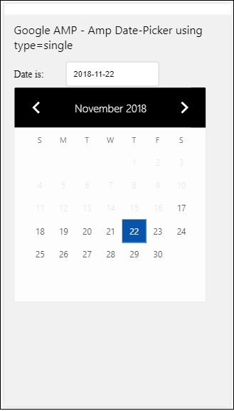
请注意,在此示例中,我们默认在屏幕上显示日历,即 datepicker。
用户选择的日期显示在文本字段中,如下面的演示屏幕所示 −
输出
如何从 amp-date-picker 获取选择的日期?
如果您查看上述示例,则有一个名为 input-selector 的属性,它被赋予了文本字段的 id。当用户选择日期时,它会显示在输入字段内。
<amp-date-picker
   id = "static-date"
   type = "single"
   mode = "static"
   layout = "fixed-height"
   height = "600"
   format = "YYYY-MM-DD"
   input-selector = "#date"

   <div class = "row">
      <div class = "col-label">
         <label for = "start">Date is:</label>
      </div>
      <div class = "col-content">
         <input type = "text" id = "date" name = "date"
         placeholder = "Date Selected Is...">
      </div>
   </div>

</amp-date-picker>
您还可以为 input-selector 属性赋予 name 属性,如下所示 −
<amp-date-picker
   type = "single"
   mode = "static"
   layout = "container"
   input-selector = "[name = date]">
   <input type = "text" id = "date" name = "date" placeholder = "Date Selected Is...">
</amp-date-picker>
如果未指定输入选择器,则 amp-date-picker 会创建一个隐藏的输入字段,并使用 amp-date 选择器的 id 为其指定名称 date 或 ${id}-date。
我们将讨论更多示例,其中 date-picker 具有不同的属性。在上面,我们可以选择单个日期,因为我们提到 type="single" 并将模式设为静态。我们还可以通过指定类型为 type="range" 来选择日期范围。
示例
<!doctype html>
<html amp lang = "en">
   <head>
      <meta charset = "utf-8">
      <script async src = "https://cdn.ampproject.org/v0.js"></script>
      <title>Google AMP - Amp Date-Picker Static </title>
      <link rel = "canonical" href = "http://example.ampproject.org/article-metadata.html">
      <meta name = "viewport" content = "width = device-width, minimum-scale = 1,initial-scale = 1">

      <style amp-boilerplate>
         body{-webkit-animation:
            -amp-start 8s steps(1,end) 0s 1 normal both;-moz-animation:
            -amp-start 8s steps(1,end) 0s 1 normal both;-ms-animation:
            -amp-start 8s steps(1,end) 0s 1 normal both;animation:
            -amp-start 8s steps(1,end) 0s 1 normal both
         }
         @-webkit-keyframes
         -amp-start{from{visibility:hidden}to{visibility:visible}}@-moz-keyframes
         -amp-start{from{visibility:hidden}to{visibility:visible}}@-ms-keyframes
         -amp-start{from{visibility:hidden}to{visibility:visible}}@-o-keyframes
         -amp-start{from{visibility:hidden}to{visibility:visible}}@keyframes
         -amp-start{from{visibility:hidden}to{visibility:visible}}
      </style>
      <noscript>
         <style amp-boilerplate>
            body{
            -webkit-animation:
            none;-moz-animation:none;-ms-animation:none;animation:none}
         </style>
      </noscript>

      <script async custom-element = "amp-date-picker"
         src = "https://cdn.ampproject.org/v0/amp-date-picker-0.1.js">
      </script>

      <script async custom-element = "amp-bind"
         src = "https://cdn.ampproject.org/v0/amp-bind-0.1.js">
      </script>

      <script async custom-template = "amp-mustache"
         src = "https://cdn.ampproject.org/v0/amp-mustache-0.1.js">
      </script>

      <style>
         input[type = text]{
            width: 50%;
            padding: 12px;
            border: 1px solid #ccc;
            border-radius: 4px;
            resize: vertical;
         }
         label {padding: 12px 12px 12px 0;display: inline-block;}
         .col-label {float: left;width: 25%;margin-top: 6px;}
         .col-content {float: left;width: 75%;margin-top: 6px;}
         .row:after {content: "";display: table;clear: both;}
         .amp_example {
            background-color: #f1f1f1;
            padding: 0.01em 16px;
            margin: 20px 0;
            box-shadow: 0 2px 4px 0
            rgba(0,0,0,0.16),0 2px 10px 0
            rgba(0,0,0,0.12)!important;
         }
         h3{
            font-family: "Segoe UI",Arial,sans-serif;
            font-weight: 400;margin: 10px 0;
         }
      </style>
   </head>
   <body>
      <div class = "amp_example">
         <h3>Google AMP - Amp Date-Picker Static Multi Select Dates using type = range</h3>
         <amp-date-picker
            id = "static-date"
            type = "range"
            mode = "static"
            layout = "fixed-height"
            height = "600"
            start-input-selector = "#start"
            end-input-selector = "#end"
            format = "YYYY-MM-DD"
            input-selector = "#static-date-input">

            <div class = "row">
               <div class = "col-label">
                  <label for = "start">Start Date:</label>
               </div>
               <div class = "col-content">
                  <input type = "text" id = "start"
                  name = "start" placeholder = "Start Date">
               </div>
            </div>
            <div class = "row">
               <div class = "col-label">
                  <label for = "end">End Date:</label>
               </div>
               <div class = "col-content">
                  <input type = "text" id = "end"
                  name = "end" placeholder = "End Date">
               </div>
            </div>
         </amp-date-picker>
      </div>
   </body>
</html>
输出
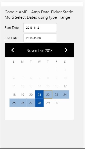
上面显示的代码的输出如下所示 −
如何使用从 amp-date-picker 中选择的 type= "range" 获取开始和结束日期?
为了获取开始和结束日期,我们使用了 amp-date-picker 属性 start-input-selector 和 end-input-selector。
语法的详细信息显示在此处 −
<amp-date-picker
   id = "static-date"
   type = "range"
   mode = "static"
   layout = "fixed-height"
   height = "600"
   start-input-selector = "#start"
   end-input-selector="#end"
   format = "YYYY-MM-DD"
   input-selector = "#static-date-input">

   <input type = "text" id = "start" name = "start" placeholder="Start Date">
   <input type = "text" id = "end" name = "end" placeholder = "End Date">
</amp-date-picker>
两个选择器都有输入字段 ID,我们希望在其中显示开始和结束日期。您还可以提供输入字段的名称,如此处所述。
AMP 覆盖日期选择器
对于覆盖模式日期选择器,日历会响应输入字段显示。我们可以使用 type=" single" 和 type=" range" 的覆盖,就像我们在静态日期选择器中看到的那样。
现在让我们看一个为覆盖类型日期选择器选择日期范围的工作示例。
示例
<!doctype html>
<html amp lang = "en">
   <head>
      <meta charset = "utf-8">
      <script async src = "https://cdn.ampproject.org/v0.js"></script>
      <itle>Google AMP - Amp Date-Picker Static</title>
      <link rel = "canonical" href = "http://example.ampproject.org/article-metadata.html">
      <meta name = "viewport" content = "width = device-width,minimum-scale = 1,initial-scale = 1">
      <style amp-boilerplate>
         body{
            -webkit-animation:
            -amp-start 8s steps(1,end) 0s 1 normal both;-moz-animation:
            -amp-start 8s steps(1,end) 0s 1 normal both;-ms-animation:
            -amp-start 8s steps(1,end) 0s 1 normal both;animation:
            -amp-start 8s steps(1,end) 0s 1 normal both
         }
         @-webkit-keyframes
         -amp-start{from{visibility:hidden}to{visibility:visible}}@-moz-keyframes
         -amp-start{from{visibility:hidden}to{visibility:visible}}@-ms-keyframes
         -amp-start{from{visibility:hidden}to{visibility:visible}}@-o-keyframes
         -amp-start{from{visibility:hidden}to{visibility:visible}}@keyframes
         -amp-start{from{visibility:hidden}to{visibility:visible}}
      </style>
      <noscript>
         <style amp-boilerplate>
            body{
            -webkit-animation:
            none;-moz-animation:none;-ms-animation:none;animation:none}
         </style>
      </noscript>

      <script async custom-element = "amp-date-picker"
         src = "https://cdn.ampproject.org/v0/amp-date-picker-0.1.js">
      </script>
      <script async custom-element = "amp-bind"
         src = "https://cdn.ampproject.org/v0/amp-bind-0.1.js">
      </script>
      <script async custom-template = "amp-mustache"
         src = "https://cdn.ampproject.org/v0/amp-mustache-0.1.js">
      </script>

      <style>
         input[type=text]{
            width: 50%;
            padding: 12px;border:
            1px solid #ccc;
            border-radius: 4px;resize: vertical;
         }
         label {
            padding: 12px 12px 12px 0;
            display: inline-block;
            font-family: "Segoe UI",Arial,sans-serif;
            font-weight: 400;
         }
         .col-label {float: left;width: 25%;margin-top: 6px;}
         .col-content {float: left;width: 75%;margin-top: 6px;}
         .row:after {content: "";display: table;clear: both;}
         .amp_example {
            background-color: #f1f1f1;
            padding: 0.01em 16px;
            margin: 20px 0;
            box-shadow: 0 2px 4px 0
            rgba(0,0,0,0.16),0 2px 10px 0
            rgba(0,0,0,0.12)!important;
         }
         h3{font-family: "Segoe UI",Arial,sans-serif;font-weight: 400;margin: 10px 0;}
         button { background-color: #ACAD5C;
            color: white;
            padding: 12px 20px;
            border: none;
            border-radius: 4px;
            cursor: pointer;
            float: right;
         }
      </style>
   </head>
   <body>
      <div class = "amp_example">
         <h3>Google AMP - Amp Date-Picker Overlay Multi Select Dates using type = rangelt;/h3>
         <amp-date-picker id = "overlay-date"
            type = "range"
            mode = "overlay"
            start-input-selector = "#start"
            end-input-selector = "#end"
            format = "YYYY-MM-DD"
            open-after-select
            input-selector = "#start">

            <div class = "row">
               <div class = "col-label">
                  <label for = "start">Start Date:lt;/label>
               </div>
               <div class = "col-content">
                  <input type = "text" id = "start"
                     name = "start" placeholder = "Start Date">
               </div>
            </div>
            <div class = "row">
               <div class = "col-label">
                  <label for = "end">End Date:lt;/label>
               </div>
               <div class = "col-content">
                  <input type = "text" id="end" name = "end"
                     placeholder = "End Date">
               </div>
            </div>
            <div class = "row">
               <div class = "col-label">
               </div>
               <div class = "col-content">
                  <button class = "ampstart-btn caps" on = "tap:overlay-date.clear">
                     Clear
                  </button>
               </div>
            </div>
        </amp-date-picker>
     </div>
  </body>
</html>
输出
上面显示的代码的输出如下所示 −
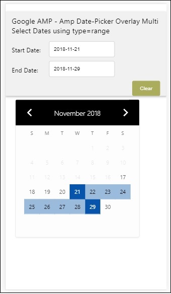
我们已经了解了如何获取开始和结束日期。请注意,我们在这里使用了另一个属性 open-after-select。此属性将在选择后保持覆盖层打开。如果您单击日期选择器外部,它将关闭。还添加了一个名为 clear 的按钮。单击 clear 按钮时,所选日期将被清除。执行此操作的语法如下 −
<button class = "ampstart-btn caps" on = "tap:overlay-date.clear">
   Clear
</button>
要添加事件,我们必须使用 on 属性。有关事件的更多详细信息将在本教程的 Events 章节中讨论。我们使用了标签行为,并为此指定了 datepicker 的 id 和 clear 事件,该事件负责清除所选的日期范围。
接下来,让我们看看如何将 amp-date-picker 用作灯箱。
AMP Lightbox 日期选择器
日期选择器可以在模式窗口内使用。我们也可以使用 lightbox 日期选择器来实现这一点。让我们借助一个实际示例来理解这一点。
要在 lightbox 中使用日期选择器,我们需要添加 light-box 脚本,如下所示 −
<script async custom-element = "amp-lightbox"
   src = "https://cdn.ampproject.org/v0/amp-lightbox-0.1.js">
</script>
示例
<!doctype html>
<html amp lang = "en">
   <head>
      <meta charset = "utf-8">
      <script async src = "https://cdn.ampproject.org/v0.js"></script>
      <title>Google AMP - Amp Date-Picker Static </title>
      <link rel = "canonical" href = "http://example.ampproject.org/article-metadata.html">
      <meta name = "viewport" content = "width=device-width,minimum-scale = 1,initial-scale = 1">

      <style amp-boilerplate>
         body{
            -webkit-animation:
            -amp-start 8s steps(1,end) 0s 1 normal both;-moz-animation:
            -amp-start 8s steps(1,end) 0s 1 normal both;-ms-animation:
            -amp-start 8s steps(1,end) 0s 1 normal both;animation:
            -amp-start 8s steps(1,end) 0s 1 normal both
         }
         @-webkit-keyframes
         -amp-start{from{visibility:hidden}to{visibility:visible}}@-moz-keyframes
         -amp-start{from{visibility:hidden}to{visibility:visible}}@-ms-keyframes
         -amp-start{from{visibility:hidden}to{visibility:visible}}@-o-keyframes
         -amp-start{from{visibility:hidden}to{visibility:visible}}@keyframes
         -amp-start{from{visibility:hidden}to{visibility:visible}}
      </style>
      <noscript>
         <style amp-boilerplate>
            body{
               -webkit-animation:none;
               -moz-animation:none;
               -ms-animation:none;
               animation:none}
         </style>
      </noscript>

      <script async custom-element = "amp-date-picker"
         src = "https://cdn.ampproject.org/v0/amp-date-picker-0.1.js">
      </script>

      <script async custom-element = "amp-bind" src = "
      https://cdn.ampproject.org/v0/amp-bind-0.1.js">
      <script>

      <script async custom-template = "amp-mustache"
         src = "https://cdn.ampproject.org/v0/amp-mustache-0.1.js">
      </script>

      <script async custom-element = "amp-lightbox"
         src = "https://cdn.ampproject.org/v0/amp-lightbox-0.1.js">
      </script>

      <style>
         input[type=text]{
            width: 50%;
            padding: 12px;
            border: 1px solid #ccc;
            border-radius: 4px;
            resize: vertical;
         }
         label {
            padding: 12px 12px 12px 0;
            display: inline-block;
            font-family: "Segoe UI",Arial,sans-serif;
            font-weight: 400;
         }
         .col-label {
            float: left;width: 25%;
            margin-top: 6px;
         }
         .col-content {
            float: left;
            width: 75%;
            margin-top: 6px;
         }
         .row:after {
            content: "";
            display: table;clear: both;
         }
         .amp_example {
            background-color: #f1f1f1;
            padding: 0.01em 16px;
            margin: 20px 0;
            box-shadow: 0 2px 4px 0 rgba(0,0,0,0.16),0 2px 10px 0rgba(0,0,0,0.12)!important;
         }
         h3{font-family: "Segoe UI",Arial,sans-serif;
            font-weight: 400;
            margin: 10px 0;
         }
         button {
            background-color: #ACAD5C;
            color: white;
            padding: 12px 20px;
            border: none;
            border-radius: 4px;
            cursor: pointer;
            float: right;
         }
         .lightbox {background-color: rgba(100, 100, 100, 0.5);}
      </style>
   </head>
   <body>
      <div class = "amp_example">
         <h3>Google AMP - Amp Date-Picker Overlay Multi Select Dates using type = range</h3>
         <div class = "row">
            <div class = "col-label">
               <label for = "start">Start Date:</label>
            <div>
            <div class = "col-content">
               <input type = "text" id = "start" name =
               "start" placeholder = "Start Date" on = "tap:lightbox.open">
            </div>
         </div>
         <div class = "row">
            <div class = "col-label">
               <label for = "end">End Date:</label>
            </div>
            <div class = "col-content">
               <input type = "text" id = "end" name =
                  "end" placeholder = "End Date" on = "tap:lightbox.open">
            </div>
         </div>
         <div class = "row">
            <div class = "col-label"></div>
            <div class = "col-content">
            <button class = "ampstart-btn caps" on =
               "tap:overlay-date.clear">Clear</button>
            </div>
         </div>
         <amp-lightbox id = "lightbox" layout = "nodisplay" class = "lightbox">
            <amp-date-picker id = "overlay-date"
               type = "range"
               layout = "fill"
               start-input-selector = "#start"
               end-input-selector = "#end"
               format = "YYYY-MM-DD"
               on = "activate: lightbox.open;deactivate: lightbox.close">
            </amp-date-picker>
         </amp-lightbox>
      </div>
   </body>
</html>
输出
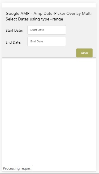
当用户点击输入字段时,日期选择器将在灯箱内打开,如下所示 −
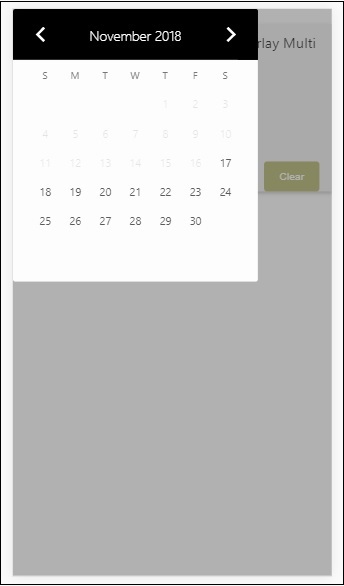
要执行此操作,请在输入字段上添加一个事件,如下所示 −
<input type = "text" id = "start" name = "start"
   placeholder = "Start Date" on = "tap:lightbox.open">

<input type = "text" id = "end" name = "end"
   placeholder = "End Date" on = "tap:lightbox.open">
请注意,"on" 是调用点击 − lightbox.open 打开灯箱的事件。
此处 lightbox 是分配给 amp-lightbox 的 ID,如下所示。Amp-date-picker 在 amp-lightbox 内部调用,并在点击输入字段时激活。
<amp-lightbox id = "lightbox" layout = "nodisplay" class = "lightbox">
   <amp-date-picker id = "overlay-date"
      type = "range"
      layout = "fill"
      start-input-selector = "#start"
      end-input-selector = "#end"
      format = "YYYY-MM-DD"
      on = "activate: lightbox.open;deactivate: lightbox.close">
   </amp-date-picker>
</amp-lightbox>

