
Google AMP - 样式和自定义 CSS
Amp 经过深思熟虑后才将页面呈现在屏幕上。加载的页面将包含图像、视频、iframe 等,这些都是需要执行的更多 http 请求。因此,需要执行的 http 请求会被延迟,以便显示页面上的内容,并为要加载的图像、视频、iframe 创建必要的空间。
Amp 具有占位符、后备、srcset 和布局属性等功能,可使页面具有响应性,并确保页面上的内容不会受到干扰。在本章中,我们将详细讨论所有这些内容。
Amp 样式标签
Amp 有一个带有 amp-custom 的样式标签,如下所示 −
<style amp-custom>
   button{
      background-color: #ACAD5C;
      color: white;
      padding: 12px 20px;
      border: none;
      border-radius: 4px;
      cursor: pointer;
      float: left;
   }
   amp-img {
      border: 1px solid black;
      border-radius: 4px;
      padding: 5px;
   }
   p {
      padding: 1rem;
      font-size:25px;
   }
   largeText {
      font-size:30px;
      background-color:red;
   }
</style>
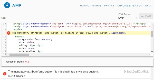
它主要用于编写页面所需的自定义 css。请不要忘记添加 amp-custom 属性;否则它将无法通过 amp 验证,如下所示 −
Amp 还支持 html 元素的内联 css,如下所示 −
<div style = "color:green;margin-left:30px;">
Welcome to TutorialsPoint</p>
外部样式表标签
Amp 不支持外部样式表,在通过 amp 验证时将无法通过验证。
示例
<!doctype html>
<html amp lang = "en">
   <head>
      <meta charset = "utf-8">
      <script async src = "https://cdn.ampproject.org/v0.js"></script>
      <title>Google AMP - Dynamic Css Classes</title>
         <link rel = "canonical" href = "
         http://example.ampproject.org/article-metadata.html">
      <meta name = "viewport" content = "width = device-width,minimum-scale = 1,initial-scale = 1">

      <style amp-boilerplate>
         body {
            -webkit-animation:
            -amp-start 8s steps(1,end) 0s 1 normal both;-moz-animation:
            -amp-start 8s steps(1,end) 0s 1 normal both;-ms-animation:
            -amp-start 8s steps(1,end) 0s 1 normal both;animation:
            -amp-start 8s steps(1,end) 0s 1 normal both
         }
         @-webkit-keyframes
         -amp-start{from{visibility:hidden}to{visibility:visible}}@-moz-keyframes
         -amp-start{from{visibility:hidden}to{visibility:visible}}@-ms-keyframes
         -amp-start{from{visibility:hidden}to{visibility:visible}}@-o-keyframes
         -amp-start{from{visibility:hidden}to{visibility:visible}}@keyframes
         -amp-start{from{visibility:hidden}to{visibility:visible}}
      </style>

      <noscript>
         <style amp-boilerplate>
            body {
               -webkit-animation:none;
               -moz-animation:none;
               -ms-animation:none;
               animation:none
            }
         </style>
      </noscript>
         <script async custom-element = "amp-bind" src = "
      https://cdn.ampproject.org/v0/amp-bind-0.1.js">
      </script>

      <script async custom-element = "amp-dynamic-css-classes"
         src = "https://cdn.ampproject.org/v0/amp-dynamic-css-classes-0.1.js">
      </script>

      <link rel = "stylesheet"
         href = "https://cdnjs.cloudflare.com/ajax/libs/materialize/0.9 8.0/css/materialize.min.css">
      <style amp-custom>
         p {
            padding: 1rem;
            font-size:25px;
         }
      </style>
   </head>
   <body>
      <h3>Google AMP - Dynamic Css Classes</h3>
      <div style = "color:green;margin-left:30px;">
      Welcome to TutorialsPoint</p>
   </body>
</html>
使用 AMP 验证器 进行验证时,我们收到以下错误。
要以响应方式显示页面中的元素,amp 元素需要指定元素在页面上的宽度和高度。添加 layout = "responsive" 将使元素在页面上保持响应,同时保持纵横比。
有关布局属性的详细信息,请参阅Google AMP – 布局一章。

